Xchanges >> Issue 6.1>> Typeface and Document Persona in Magazines
Typeface and Document Persona in Magazines
Nida M. Stewart
Abstract
We are constantly exposed to elements of typography in our daily lives, yet we rarely pay attention to the implications of how it is used. Although numerous studies have been conducted about proper uses of typeface, effects of typeface on a document, and the possibility of typeface affecting the tone or personality of a document, few (if any) studies conducted observe the use of typography in published media. The goal of this study was to observe various magazines to determine whether there are typographic trends within magazines themselves as well as with magazines oriented towards specific demographics. Two issues of each of twelve magazines (for a total of twenty-four individual issues) were obtained for this study. Criteria were made based on previous studies to categorize the various typefaces observed. The results showed that headings were mostly in bold typefaces, articles were in serif typefaces, and other miscellaneous blurbs were generally in sans serif typefaces. Although these results cannot encompass the hundreds of magazines not observed, we can assume from the data obtained that the magazines observed follow general typographic trends. As suggested by the trends observed in this study, the similar strategies for font types used by magazines may reflect awareness of font effectiveness within print media.
In a world where we place considerable emphasis on document design, a significant amount of research focuses on finding the most efficient means of effectively creating an appealing document, especially in the field of technical communication. Research in the field of visual rhetoric focuses on design elements such as page layout, appropriate color usage, as well as effective utilization of typography. An extensive amount of research focuses on both page layout and color usage while a lesser amount of research spotlights the latter, typography. Based on the limited findings in previous research, there is certainly a compelling need for more study of the various utilizations of typeface in documents. Understanding typographical elements gives us a better understanding of how to design effective documents geared toward appropriate audiences.
This study focuses on the use of typeface in a specific medium: magazines. The majority, if not all, of the recent studies of typography focus on pre-tailored documents with typefaces and document contexts formatted by the researchers. From the research I conducted, I was unable to find observations of published media not modified by researchers. My study revolves around seeing if magazines utilize typographic trends and if typographic trends are influenced by the demographic they are targeted toward.
This study will discuss some of the research that has been conducted on the matter of typography and show the impact typography can have on a document. Following a comprehensive literature review on the topic of typography, I will describe the methodology behind my own research study, outline the observations I made while conducting my study, and analyze the results of my study.
Literature Review
Background
Typography is the modification, design, and arrangement of glyphs and letters, creating a communication method alternative to oral communication. Even though we may spend little time actually thinking about typography, we are constantly exposed to it. When we drive down the road, we often see billboards with creative typography attempting to interest us in what companies are selling. When we browse the Internet, we are constantly exposed to various typefaces even if we do not realize it. Even when we make dinner, most of the products we have in our cupboards or refrigerator use imaginative typography, along with appealing images, to attract our attention. Typography is used in numerous forms of communication, but we often do not take the time to understand the implications of the typefaces that we use. Although color and layout are both important aspects of visual design and communication, typography is something that garners less attention than the other aspects of visual design.
In order to understand the importance of typography in a document, we need to investigate whether typography is actually important to a document, the implications of whether or not typeface can convey a visual message (often referred to as a “persona”), and whether typeface persona has an impact on the persona of the text itself (Brumberger 207). As mentioned above, typographic persona is the visual message or personality a typeface displays, whether it be friendly, professional, or casual, for instance. For example, a document written with a curvy, bubbly typeface (such as Comic Sans MS) may be seen as friendly or childish. With the understanding of typeface persona established, we are able to analyze whether or not the presence of varying typeface personae affects a document (Brumberger). For example, a document written with a serif font (such as Times New Roman) may be taken more seriously than a document written in Comic Sans MS because Times New Roman looks more clean and professional than Comic Sans MS. Understanding the importance of typeface persona is vital because it gives us another means of making a document more appealing to an audience.
How Typography Affects a DocumentWith the revolution of computers and the revolution of word processing, people are able to access various collections of typography at the press of a button (Gump 270). Many people use certain typefaces as default but others utilize these depending on their mood or personal preference. Regardless of what typefaces we select, the typography we decide to use can directly influence the readability of a document. Part of John E. Gump’s research revolves around the effect of typography on readability of a document. Gump elaborates on Stopke and Staley’s study of characteristics that make one typeface different from another, such as the presence of serifs or the extension of a letter above or below the actual body of the letter (270). He uses these characteristics to define generalized styles of typography, giving us a generalized framework of what we consider typeface persona. Understanding these basics of typeface helps us understand how varied typography can be and why it is necessary to utilize typeface properly.
Gump’s study involves giving a sample group a message written in ten different typefaces and telling them to rate these typefaces as easy or difficult to read. The majority of his subjects agreed on the readability of the fonts provided. These results showed that the majority of the fonts he used in his study were either easy or difficult to read, with only one result being close to the center of the spectrum. Comprehending the results of Gump’s study shows us that typeface affects whether or not a document is easy to read. The utilization of an improper typeface in a document results in poor document design.
Clive Lewis and Peter Walker further elaborate on Gump’s study by also illustrating the importance of typeface through its effect on reading. Lewis and Walker’s study focuses on “the perceptual qualities possessed by different typefaces” in relation to reading a document (241). The study rates typography as being fast or slow and/or heavy or light. One experiment conducted rates typefaces based on categories like the ones listed prior, and the typefaces shown are demonstrated by words that either correspond or refute qualities of these typefaces. Whereas Gump’s study showed that typeface varies greatly and that typography affects a document’s ability to easily be read, Lewis and Walker prove that there is typographic influence when a person reads a document and confirm that there is correlation between the typographic features of a word and the meaning derived from the text itself. This information tells us that we need to pay attention to typography choices when creating a document.
Where Lewis and Walker’s study focused on typographic influences on reading, Thomas Wehr and Werner Wippich took a different approach and researched the effect of typography and color on memory. They tested whether words written in color or in a distinct typeface would improve the memory of a subject. They determined that words written in a distinct typeface or in color were thought of as “remembered” than words that did not display these features. This study shows us that typeface may have a distinct effect on memory, especially if something is written in a distinct typeface.
Another study that emphasizes the importance of typography is Emily Skarzenski’s examination of Colin Wheidon’s studies. She takes the results of Wheidon’s studies and condenses down the information to give a brief summary of tips that document designers can utilize to make a more efficient document. She does discuss other aspects of visual design such as color and layout, but her primary focus is on the use of typography. She gives advice on things to avoid in document design such as writing text in all capital letters because it makes the text difficult to read (425). She also points out how serif font increases comprehension for readers over sans-serif fonts by five times (424). Her observations and conclusions gained from Wheidon’s work give further proof that typeface has an effect on both document presentation and cognition.
Valerie Vance’s article is similar to Emily Skarzenski’s article in that it also touches on basics of typography and the importance of properly utilizing it in a document. She focuses on document readability as well as basic tips to get the best effect when using typography in a document. Even though her article is not nearly as in-depth as the ones previously discussed, she further illustrates the point that typography “creates the personality of any publication” and that basic knowledge of typography can “make a substantial difference in the final product” (Vance).
Skarzenski, Lewis and Walker, Wehr and Wippich, Vance, and Gump all confirm that typography affects the documents they are utilized in. Improper choices in typography can negatively affect a document, whereas appropriate choices in typography can improve the quality of the document. Lewis and Walker’s study showed how typefaces affect the text, but there are more studies that prove that typeface can affect the readability of a document.
Typeface and Readability of DocumentsInstead of employing hard copies in their research (as Gump, Lewis and Walker, and Skarzenski did), Kong-King Shieh, Ming-Te Chen, and Jiunn-Huei Chuang use Visual Terminal Displays (VDT) to offer a different perspective on the effects of typeface usage. These authors collected information on correct performance, fatigue of individuals, critical fusion frequency, preference, as well as a few other sets of information involving forty subjects. The study evaluated color combinations of background and text, typography, character complexity, and frequency. The authors refer to typeface as one of “two important characteristics of visual stimuli that may affect visual performance” (170). Results obtained show that color combination has little to no effect on the identification of characters, whereas the most significant results involved the use of typography. Cluttered characters directly affect the speed of comprehension, even if the characters are aesthetically pleasing. Lewis and Walker’s study showed how typeface affects the readability of a print document; Shieh, Chen, and Chuang show that the same is also applicable for VDTs, as well. This article is another study that shows how typeface is an essential component in creating an effective document.
Another important aspect of typography is the readability of the document due to choice in type and type size. Aries Arditi’s article focuses on maximizing the readability of typeface for people who have visual disabilities. In his study, he modified typeface in numerous ways to see if changes in typography improve the readability. He tested the modified typography on people with varying ranges of visual disability. Often, we can never tell who will read documents that we produce. We also cannot be sure that the person to whom we present a document to does not have a visual disability. The results of his study showed that the manipulation of some typefaces helps readability for people with visual disabilities. If modification of typeface helps visually disabled people read documents, we can only assume that modifying typeface appropriately can also help those who are not visually disabled to view documents more easily.
Manfred MacKeben performed a similar study to Arditi’s adjustable typography article. In his article, he observes the ability of six adults to distinguish between letters displayed in various typefaces. The conclusion he came to is that if letters had similar features (such as a capital I and a lowercase l, for instance), it was harder for the subjects to distinguish between the two unless each had defining features which set them apart from one another. Adjusting specific typefaces could result in improved readability. This study shows us how selections of appropriate typefaces can assist the reader in ease of reading a document.
Arditi conducted another study with Jianna Cho to assess the effect of serifs in respect to text readability. In Arditi’s adjustable typography study, he focused on modifying typography in various ways (serifs, letter aspect ratio, letter and word spacing, etc.) to make it more readable for people with visual disabilities. In the study, Arditi and Cho focus on the resulting effect of the modification of typeface’s serif size on readability. The researchers conducted three experiments testing the effect of serif size on font legibility. One important experiment involved changing different parameters of fonts (such as serif size, spacing, and cap height) and having participants discern which parameter changes affected them. The results showed that only spacing and serif size were significant in affecting font legibility (2929). The other two experiments conducted tested the effect of these parameter changes on continuous reading and rapid presentation and recognition. Concerning both speed thresholds and continuous reading, serif size did not have a significant effect on either. Although their study did not come to any conclusive conclusions about the effect of serifs on readability, they do believe that serifs do make a slight difference when utilized with smaller sized text (2932).
Another study in a similar vein researched the effect of typographic size on the readability of text for children. Laura Hughes and Arnold Wilkins observe the effects of typographic size on the reading ability of children from the ages of five to eleven. They concluded that the older a subject was, the less difficulty they had with smaller text (321). Regardless, if the text was rather small, it induced stress within the subjects, regardless of what age group they were in. This study shows us that it is important to pay attention to the audience when making typographic decisions. Choosing a size of type that is inappropriate for the audience may lead to disinterest and unnecessary stress on the reader.
Whereas all the researchers above focused on the typeface of a document as a whole, Erica McAteer focused on using typeface styles as a method of emphasizing text, similarly to Wehr and Wippich who used color and typeface to influence saliency. In her article, McAteer writes about the use of uppercase and italics as a method of emphasis. Her study shows us how even a different style of emphasis can inherently change the implied meaning of the emphasis itself (349). Although her study does not focus on specific typefaces, she illustrates an important point about how the presentation of a document’s typography can affect the interpretation of a document as a whole.
The research of Arditi, MacKeben, Arditi and Cho, Hughes and Wilkins, McAteer, and Shieh, Chen, and Chuang all show us different ways that typography can affect readability, and all of their studies illustrated the importance of typography in various forms of media such as VDTs, computers, and print documents. Now that we better understand the importance and effects of typography, we need to understand how typographic and text persona play a part in the utilization of typography.
Typeface and Text PersonaNow that we have established the importance of typography, we can further analyze typeface by looking into typographic and text persona. The persona of text and typeface is determined by what kind of personality something such as a document or typeface portrays. This persona can range anywhere from being professional to friendly. Researchers such as Eva Brumberger and Jo Mackiewicz show us the importance of analyzing both typeface and text persona when creating a document.
In the article “The Rhetoric of Typography: The Persona of Typeface and Text,” Eva Brumberger used literary research and hypothesis testing to determine whether or not typeface and/or text have definitive persona; understanding whether or not typeface and text has definitive persona helps communicators relate the importance of matching appropriate typography with document contents. Brumberger conducted two experiments to conducted to analyze typeface and text persona. The first experiment asked students whether specific typefaces exhibit a personality. The second experiment asked students if designated collections of text exhibit a specific persona. Both experiments showed strong evidence that people can see that typeface and text can show evidence of persona. This information tells us that it would be a good idea to examine what persona a typeface or text displays as well as the persona that is attached to text before using it in a document. Even though researchers such as Gump showed us that the choice of typeface affects the ease of reading a document, Brumberger further elaborated on Lewis and Walker’s study that the selection of typeface is important since typography can relay a specific persona. She also concluded that a document itself can relay a persona of its own, which is something that Lewis and Walker did not mention.
Brumberger conducted another study of typeface persona, as discussed in her article "The Rhetoric of Typography: Effects on Reading Time, Reading Comprehension, and Perceptions of Ethos." In this experiment, she tested the effects of text and typeface persona on reading comprehension, reading time, and the perception of ethos. She determined that although her selected typefaces had no significant effect on reading time and reading comprehension, typeface selection did shape the ethos of the text and how the reader viewed the text itself (20). This study gives us the impression that, although typography may not affect our reading capabilities, the choice of typography may influence how we interpret what we read.
Jo Mackiewicz’s article focuses on another study conducted to gauge a typeface’s personality, with this one based on studying five specific letterforms to see the extent to which they affect the reader’s perception of the typefaces as friendly or professional. This study is similar to Brumberger’s research because it focuses on the persona or personality of a typeface, but this study focuses on gauging typographic personality using five specific letterforms. The letterforms she studies are the letters j, a, g, e, and n (Mackiewicz 291). She concludes that fonts which are typically seen as friendly are not seen as professional (and vice-versa). She also details different characteristics of various typefaces that change the readability and personality of a font. Although she used a different methodology to approach the matter, Mackiewicz comes to the same conclusion as Brumberger: that there is evidence that typeface persona does exist. Understanding this concept further emphasizes the importance of understanding and analyzing typography.
The article by A. Dawn Shaikh, Barbara S. Chaparro, and Doug Fox also examines whether or not personality traits are personified through typography. The study that these researchers conducted was similar to Brumberger’s study in “The Rhetoric of Typography: The persona of Typeface and Text.” The researchers took twenty different font samples and had 561 participants analyze the typefaces based on given adjectives and given uses for said typefaces. The results obtained determined that some fonts were seen as more appropriate for certain situations (such as websites or documentation) than others. The results suggest that personality traits are indeed attributed to typefaces depending on the general family they fall in (such as serif, sans serif, etc). This study further elaborates on Brumberger and Mackiewicz’s studies in that typefaces do exhibit personality traits.
Studies by Brumberger, Shaikh, Chaparro, Fox, and Mackiewicz take the previously mentioned studies a step further to show that not only is the utilization of typography is important, but also it is important to observe the persona of the typefaces being utilized. In three of their own studies, Brumberger, Shaikh, Chaparro, Fox, and Mackiewicz further employ the use of typeface persona in explaining how the misuse of a typographic persona can cause discontent in the reading of a document.
Typeface AppropriatenessTo further emphasize the importance of typographic personality, we need to see if the typeface persona actually affects the readability of the document. Following up on her previous study, Brumberger takes some of the personalities that she established in her previous studies to see whether the typeface persona affects a document. A previous study conducted by Mackiewicz shows the general importance of appropriately utilizing typeface persona.
Brumberger demonstrates the importance of the appropriate use of typeface and typeface persona, as discussed in her article "The Rhetoric of Typography: The Awareness and Impact of Typeface Appropriateness” by conducting two separate studies. The first study she conducted involves measuring whether or not a typeface is appropriate for a selected text passage that portrays a specific persona. The second study conducted involved measuring whether or not “the persona established by the typeface affects readers’/viewers’ perception of its persona established by the style and content of the text itself” (227). The first study showed that readers were “aware of the dissonance between typeface and text personas” (227). The second study showed that typeface persona has little effect on the reader’s perception of the text persona. The author concludes with questions about the effect of typeface persona on other interactions with the document such as reading time, reading comprehension, and author credibility. This study is important because it shows us the importance of relating typeface persona to a document; if a document’s typography is inappropriate, a reader will feel dissonance even if he or she is not consciously looking for this mismatch. It follows up on her previous study’s gap by further proving that writers need to structure the typefaces that they use to fit the document they are writing.
Mackiewicz’s article “What Technical Writing Students Should Know about Typeface Personality” focuses on the importance of typeface personality through the study of previous literature on typeface and typeface personalities. She elaborates on how to distinguish between appropriate and inappropriate typefaces as well as gives history on the usage of typefaces, much like Brumberger does in her own study. She also notes specific aspects of typefaces that we need to look at in order to classify them, such as proportion, modeling, and construction. This study is important because it further elaborates on typeface persona and appropriateness while showing what criteria makes one typeface different from another.
David Berleant conducted a study on thirty different proposals to see if the typeface had an effect on the assessment of the document. Berleant’s judgment criteria were whether or not the typeface makes the document favorable or less favorable and whether or not the document is visibly appealing. In relation to typeface, he concludes that headings should be in sans-serif fonts, and font sizes should be less than 12pt because it helps emphasized whether or not people view said proposals as more favorable. The document is a bit misleading because the author focuses on more aspects than just typography and typeface, and type and type size are not the primary focus in the document; he also focuses on word choice and stylistic elements. Just as Brumberger showed that inappropriate typeface in a document causes feelings of dissonance, Berleant’s study showed us that Brumberger and Mackiewicz are not the only ones that care about the appropriateness of typeface in a document.
Brumberger, Berleant, and Mackiewicz prove the same point using different strategies, showing us that it is important to pay attention to typefaces and the persona that they portray. Significantly, many of these studies have been conducted in controlled situations, which make us wonder if these studies would hold up in uncontrolled environments.
Trends in Researched MediaAll the researchers discussed in previous sections have shown us the different ways that typeface affects the documents that we read. We can see typefaces as being easy or difficult to read, while in other situations, we see it as being appropriate or inappropriate for the type of document we are looking at. While researchers have analyzed typeface in controlled situations, as stated in the above research, there is a gap in field observation of persona trends. Most of the research conducted in the study of typography and typographical elements generally revolves around controlled selections of typeface and reading material. Few, if any, studies have analyzed material in a publication such as a magazine to see if typographical design properties are utilized.
Whereas previous studies that I have found primarily focus on short passages modified by the researcher as necessary, I will be looking comprehensively at typography in magazines. The goal of this study is to address this gap by observing a specific type of media (magazines) to see if there are trends in the utilization of typeface and typeface persona. I also want to see if these trends vary depending on the demographic at which the magazine is aimed .
Researching typographic trends in media would be very beneficial to the current studies of typography because, as mentioned above, I was unable to find any studies on typography involving already published media. Although it is beneficial to show the importance of typography and how it affects a document, it is important to know whether publishers see this importance and apply these typographic guidelines in their documents. This study is beneficial to both technical communication and typographic studies because magazines are a widely read medium that reach thousands of people, making them a worthy medium of observing. Unlike books which generally adhere to a given format (such as trade paperback novels), there is a lot more flexibility in the design of magazines. Investigating such a flexible, popular medium would be optimal for observing possible typographic trends.
Research Methodology
This research project consisted of a single study with multiple research objectives. My first objective was to establish a set of research criteria to help determine the persona of the typography in the selected magazines. My second objective was to answer the question “Are there trends in the utilization of typeface and persona in a selection of given magazines?” I answered this question by taking the criteria created from my first objective and using it to determine the persona of the text in magazines. Once I completed this part of my study, I analyzed the results I obtained to determine whether there was a viable trend in typographic usage. My third objective was to answer, “Are there visible trends in typography in regard to the demographic the magazine is targeting?” I answered this question by taking the results I obtained from the second objective and checking to see if particular demographics had their own trends in regards to typeface and typeface persona.
MaterialsI obtained two issues of twelve different magazines for this study, for twenty-four magazines total. A comprehensive list of these magazines can be found in Table 1: Category and Magazine Choices.
I initially selected four initial categories for magazines. Male-Oriented and Female-Oriented magazines focused on their specific demographic as well as varying adult age groups. News magazines included weekly printed news magazines. I selected miscellaneous magazines based on easily accessible popular niche magazines. A list of magazines I chose are in Table 1 below.
Male-Oriented |
Female-Oriented |
News |
Miscellaneous |
Maxim |
Glamour |
Time |
Game Informer |
FHM |
Cosmopolitan |
Newsweek |
Rolling Stone |
Outside |
Redbook |
|
|
Men’s Health Best Life |
Good Housekeeping |
|
|
The first two magazines in both the Male-Oriented and Female-Oriented categories in the table above are oriented towards a younger adult audience (late teens to early thirties), while the last two magazines in both categories are oriented towards older audiences (early thirties and older). News magazines are oriented towards adults who are interested in current events, while the Miscellaneous magazines are oriented towards adults who are interested in various niches (video games and music/popular culture).
Research CriteriaI derived my research criteria for my magazines by combining the personality traits illustrated in Eva Brumberger’s article "The Rhetoric of Typography: The Persona of Typeface and Text" and A. Dawn Shaikh, Barbara S. Chaparro, and Doug Fox’s article "Perception of Fonts: Perceived Personality Traits and Uses."
All-Purpose |
Traditional |
Script |
Bold |
Plain |
Sans Serif |
Serif |
Script/Funny |
Modern Display |
Monospaced |
Casual |
Mature |
Happy |
Assertive |
Conformist |
Unimaginative |
Formal |
Decorative |
Coarse |
Plain |
Relaxed |
Practical |
Creative |
Masculine |
Dull |
The five categories I chose for my fonts are based on Shaikh’s five font factors (Shaikh, Chaparro and Fox 4). These font factors can be seen in the first row of Table 2. The second row, also based on Shaikh’s five font factors, gives the prominent quality of the typefaces in that particular category. Rows three through five give three personality traits to each of the categories as derived from both Shaikh and Brumberger’s choices of personality traits.
To better illustrate the kinds of typefaces that would fall into each category, Table 3 below shows examples of each category. All-Purpose contains fonts with no serifs that are not monospaced. Traditional contains fonts with serifs. Script contains fonts that do not fit with the first two categories; these fonts are generally decorative in nature. Bold contains fonts that contain thicker lines than other typefaces and often used in signs and displays. Plain contains fonts that are monospaced and typically seen used in terminal programs on computers.
All-Purpose |
Traditional |
Script |
Bold |
Plain |
Arial |
Garamond |
Comic Sans MS |
Broadway |
Courier New |
Calibri |
Times New Roman |
Vivaldi |
Stencil |
Consolas |
Tahoma |
Cambria |
Brush Script MT |
Impact |
OCR A Extended |
Verdana |
Book Antiqua |
Curlz MT |
Snap ITC |
Lucida Console |
My magazine research primarily focused on the typefaces of articles and section headings as well as the body text of the articles themselves. I also looked at various text snippets that are not long enough to be articles themselves but are part of the magazine (which I refer to as “blurbs”). Advertisements are ignored because the magazines themselves do not determine the design of advertisements.
Magazine AnalysisThis section gives a brief description of each magazine that I observed as well as the observed criteria within each. Examples of the employed typefaces are shown as necessary.
MaximMaxim is a magazine geared towards males in their late teens and twenties. Articles focus on interviews and photo shoots with attractive, scantily clad women, sports, video games, alcohol, and other amusements that may appeal to the targeted age group.
ObservationsMaxim is mostly consistent with the typography of its articles. The majority of the article headings are Bold with serifs; however, some articles (only the ones under the “Column” sections) have All-Purpose headings. Although this style choice is not consistent with the rest of the magazine, it is consistent through each issue of the magazine. Both issues observed had Bold headings with serifs for the majority of the articles, while the “Column” sections in both issues had All-Purpose headings as seen below in Figure 1: Heading Comparison in Maxim.
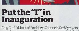
Figure 1: Heading Comparison in Maxim
Both body text and callouts were consistent throughout both magazines and issues. Body text was always Traditional while callouts and other blurbs were always in All-Purpose as shown in Figure 2: Body Text and Blurbs in Maxim.
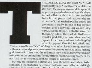

Figure 2: Body Text and Blurbs in Maxim
FHM is a British magazine popular in the United States that is geared towards males in their late teens and twenties. Like Maxim, the articles focus on photo shoots and interviews with attractive, scantily clad women, male fashion, gadgets, video games, and other topics of interest that may appeal to the targeted age group.
ObservationsFHM appears to be more consistent with its typography than Maxim. The headings for each of the articles were Bold and sans serif, as seen in Figure 3: Headings from FHM.
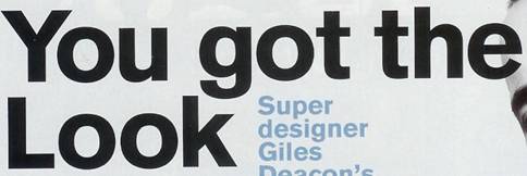
Figure 3: Headings from FHM
The body text for articles was Traditional while blurbs and other information were always in All-Purpose as seen below in Figure 4: Body Text and Blurbs from FHM.
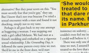
Figure 4: Body Text and Blurbs from FHM
Men’s Health Best Life is geared towards males in their thirties and beyond. Articles focus on fitness, fashion, health, finances, celebrity interviews, and other topics that may appeal to the targeted demographic.
ObservationsSection headings in Men’s Health Best Life were always in All-Purpose, where the article headings would always be in Traditional, as seen in Figure 5: Headings for Men's Health Best Life.
Figure 5: Headings for Men's Health Best Life.
Full-length article body text was always in Traditional, while other blurbs were written in All-Purpose.
OutsideOutside is geared primarily towards the active male in their twenties and beyond. The articles focus on outdoor activity, travel, merchandise for the active man, health, as well as other topics that would appeal to a man with an active lifestyle.
ObservationsArticle headings were all in Bold sans serif. As with previous magazines, full-length article body text is in Traditional while shorter articles and blurbs were written in All-Purpose as seen below in Figure 6: Outside Typography Example.
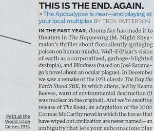
Figure 6: Outside Typography Example
Glamour is tailored primarily to women in their late teens to late twenties. The articles in the magazine focus on celebrities, fashion, health, sex, relationship advice, and other topics that would appeal to the target demographic.
ObservationsSection headings in Glamour are always in Script. Article headings are always in Bold, alternating frequently between serif and sans serif.
Figure 7: Section Headings and Article Headings in Glamour
Full-length article body text is always in Traditional (as seen in Figure 8: Body Text in Glamour); shorter articles and blurbs are always in All-Purpose.
Figure 8: Body Text in Glamour
Cosmopolitan, similar to Glamour, is tailored for women in their late teens to their late twenties. The articles focus on celebrities, sex advice and tips, fashion, relationship advice, health, beauty, and other topics that would appeal to the target demographic.
ObservationsCompared to all of the other magazines, Cosmopolitan was the most erratic in typeface usage. Section headings were Bold sans serif. I could find no trend with article headings. Some pages would have Bold sans serif while others would have Bold serif headings. Some pages had Script headings which were random and infrequent. Examples of some headings can be seen in Figure 9: Examples of Headings for Cosmopolitan.
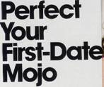
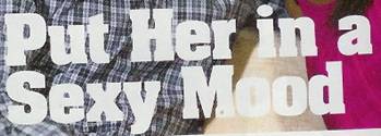
Figure 9: Examples of Headings for Cosmopolitan
Longer articles’ body text was generally Traditional. Shorter articles, however, tended to vary. The majority of blurbs and shorter articles had All-Purpose typeface, but sometimes some blurbs would be in Traditional. As with the headings, the choices of what was Traditional and that which was All-Purpose had no real pattern that I could discern.
Good HousekeepingGood Housekeeping is tailored toward women who are in their thirties and older who have settled down and have homes and families. The articles focus on weight loss, fashion, food, home decorating, health, family, and other subjects that would be appealing to this demographic.
ObservationsThe majority of the headings in Good Housekeeping were Traditional. Where captions and blurbs generally were All-Purpose, noticeable amounts of blurbs were in Traditional with no discernable pattern as seen in Figure 10: Blurb Comparison in Good Housekeeping.

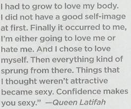
Figure 10: Blurb Comparison in Good Housekeeping
As with other magazines with full-length articles, the body text in those articles was always Traditional, as seen below in Figure 11: Body Text in Good Housekeeping.
Figure 11: Body Text in Good Housekeeping
Redbook, similar to Good Housekeeping, is targeted towards women who are in their thirties and older. The articles revolve around weight loss, finances, health maintenance, celebrity interviews, fashion and beauty, as well as other articles that would appeal to the demographic.
ObservationsArticle headings in Redbook are typically All-Purpose, sometimes alternating to Bold serif (and sometimes even Bold sans serif). An example of this can be seen in Figure 12: Redbook Heading Example.
Figure 12: Redbook Heading Example
As with most other magazines, articles have body text in Traditional, while blurbs are all in All-Purpose.
TimeTime is a magazine geared towards people in their twenties and older who are interested in keeping up-to-date on current events. The articles focus on topics that are of interest in the news today as well as on other current events.
ObservationsCompared to all of the other magazines, Time magazine is the only magazine that is entirely uniform in its formatting. All of the article headings are Bold sans serif while the section headings are All-Purpose. The body text is all Traditional. An example of this can be seen below in Figure 13: Time Headings and Body Text.
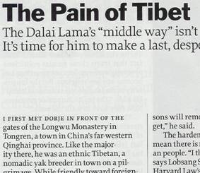
Figure 13: Time Headings and Body Text
Blurbs are always in All-Purpose and captions are always in italicized Traditional as seen in Figure 14: Time Blurbs and Captions.
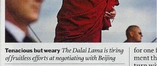
Figure 14: Time Blurbs and Captions
Like Time, Newsweek is another current event magazine geared towards people in their twenties and older who are interested on keeping up-to-date on current news and events.
ObservationsIn comparison to Time, Newsweek is not as rigid with typeface selection. Article headings are either Bold sans serif or Traditional. Section headings are always Bold with serifs. Whereas I could find trends with why some headings are the way they are in other magazines, I could not determine a definite trend with how Newsweek determined its headings. An example of how these headings varied can be seen in Figure 15: Newsweek Heading Comparison.
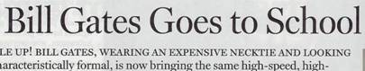
Figure 15: Newsweek Heading Comparison
Besides the heading issue, Newsweek is similar to Time in regards to everything else . Image captions are in italicized Traditional and blurbs are in All-Purpose, as seen in Figure 16: Newsweek Caption and Blurb Example.
Figure 16: Newsweek Caption and Blurb Example
Rolling Stone is a magazine tailored for people who are interested in popular culture and music. Articles in this magazine focus on musicians, celebrities, album and movie reviews, current events, and other subjects that may be of interest to the demographic targeted.
ObservationsNearly all the headings in Rolling Stone are Bold with serifs. All body text is Traditional, while other blurbs and callouts are always in All-Purpose. Examples of these can be seen below in Figure 17: Rolling Stone Article Example.
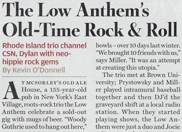
Figure 17: Rolling Stone Article Example
Game Informer is geared towards people (primarily males) who are interested in and like video games ranging from young teens and older. Articles in this magazine focus on upcoming video game releases, reviews of current video games, stories about the video game industry, as well as other articles geared toward this particular niche demographic.
ObservationsUnlike any other magazine, Game Informer primarily uses All-Purpose typeface, seen below in Figure 18: Game Informer Article Example.
Figure 18: Game Informer Article Example
The only exceptions to the All-Purpose typefaces are the headings for the article that is in Bold (yet still styled similarly to All-Purpose with the lack of serifs) and featured article headlines. Featured articles generally have Script for headings as seen below in Figure 19: Script Headings in Game Informer.
Figure 19: Script Headings in Game Informer
Synthesis of Results
This section contains the raw data of the results obtained from my observations in the previous section. Observing the raw data by demographic will better help us see possible trends.
Male-Oriented Magazines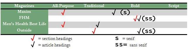
Table 4 shows the trend of section and article headings for Male-Oriented Magazines. Checkmarks under the Bold category can either be serif (s) or sans serif (ss). Black checkmarks signify article headings while red checkmarks signify section headings.
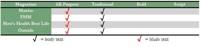
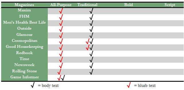
Table 5 illustrates the typographic trend of body text and miscellaneous blurbs. Black checkmarks signify body text and red checkmarks signify blurb text.
Female-Oriented Magazines
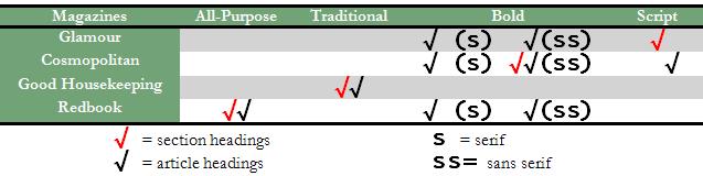
Table 6 shows the trend of section and article headings for Female-Oriented Magazines. Checkmarks under the Bold category can either be serif (s) or sans serif (ss). Black checkmarks signify article headings while red checkmarks signify section headings.
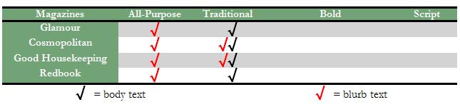
Table 7 illustrates the typographic trend of body text and miscellaneous blurbs in Female-Oriented Magazines. Black checkmarks signify body text and red checkmarks signify blurb text.
News Magazines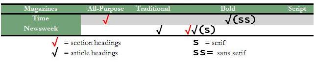
Table 8 shows the trend of section and article headings for News Magazines. Checkmarks under the Bold category can either be serif (s) or sans serif (ss). Black checkmarks signify article headings while red checkmarks signify section headings.
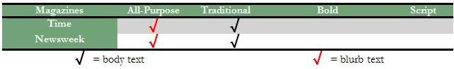
Table 9 illustrates the typographic trend of body text and miscellaneous blurbs in News Magazines. Black checkmarks signify body text and red checkmarks signify blurb text.
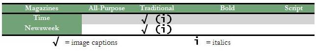
Table 10 shows the typographic choice of News Magazines in relation to image caption text. Checkmarks can signify whether the text is italicized (i).
Miscellaneous Magazines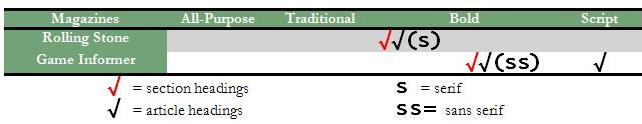
Table 11 shows the trend of section and article headings for Miscellaneous Magazines. Checkmarks under the Bold category can either be serif (s) or sans serif (ss). Black checkmarks signify article headings while red checkmarks signify section headings.
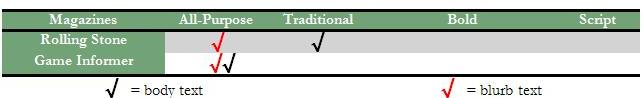
Table 12 illustrates the typographic trend of body text and miscellaneous blurbs in News Magazines. Black checkmarks signify body text and red checkmarks signify blurb text.
For clustered tables with all magazines listed together, see Appendix B: Comprehensive Heading Magazine Listing and Appendix C: Comprehensive Body Text and Blurb Magazine Listing.
DiscussionAlthough the results from my study provide valuable information that future studies can use as a basis, it is important to note that this study is rather limited in both its scope and its size. My study focused on a rather broad interpretation of typeface and typographic persona. Unlike previous studies where researchers were able to select the exact typefaces they wanted to study, it is generally harder to determine what typeface is being used in a publication. This can be the case because some publications may use typefaces that might look similar to a common typeface or use proprietary typefaces. I also limited myself to twelve different magazines with two issues from each. Although I did cover various magazines from different demographics, twelve magazines are not nearly enough to draw conclusions about magazines as a whole medium, as there are hundreds of different magazines oriented towards various age and interest groups. Even though my research was limited in these regards, there are some visible trends that I can see from the results I obtained. Even though these trends may not hold true in all other magazines, it is interesting to see these trends in the observed magazines. Observation of these trends can possibly shape further thinking about typography in general as well as influence further study of the use of typeface in media.
Various conclusions can be drawn from the results of the study. The first thing I noticed is none of the magazines had any sort of Plain (monospaced) typefaces. Monospaced typefaces take up larger amounts of space due to letter spacing, and the shape of the letters is generally larger than typefaces that are All-Purpose and Traditional. It would be both a waste of space as well as unattractive to use these kinds of fonts in a magazine. We are more likely to find monospaced typefaces on computer terminals and webpages than in magazines and other documents.
It is difficult to determine a definite trend with headings within all of the magazines. Something that can be discerned is that headings, whether they are section headings or article headings, generally tend to be in Bold. This is most likely resultant of wanting to set the title of articles and sections apart from the rest of the articles.
Using Script for headings is less common than either using All-Purpose or Traditional. This conclusion is understandable because Script typefaces are more difficult to read than Bold, Traditional, or All-Purpose typefaces. Using Script typefaces may be counterintuitive, as they may be distracting to the reader.
The News magazine category tended to have the most static typographic choices, possibly due to the assumption that people who read magazines such as Time and Newsweek are older, professional, and educated. Most, if not all, of the other magazines I observed are more geared toward casual reading, which may explain the less structured typographic choices.
In contrast to comparing headings, there seems to be a definite trend with the utilization of Traditional typefaces in articles while employing All-Purpose fonts for short blurbs and articles. All the magazines followed this trend save for the two magazines with erratic and unusual typography choices (Cosmopolitan and Good Housekeeping) as well as Game Informer (which primarily utilizes All-Purpose typefaces for the majority of their magazine). In Emily Skarzenski‘s article on "Type and Layout: How Typography and Design Can Get Your Message Across - or Get in the Way," she mentions how serif typefaces increase comprehension five times as much as sans serif fonts (Skarzenski). This statement would explain why longer articles in magazines are in Traditional typefaces than All-Purpose typefaces—more attention and concentration is necessary with longer documents.
From the information and results given, it seems inaccurate to believe that there is any sort of demographic trend in magazine headings. There appears to be no trend overall, and further limiting the results by demographic seems to lessen the odds of a plausible trend (save for bold typeface being fairly common for headings). We also have to take into account that this study only looked at two to four magazines out of hundreds that could fill a category. It is entirely possible that the analysis of more magazines in each category could yield desired results, but it is something that is currently out of the scope of this project.
Other studies that could be conducted along the same vein of this study could be to look at the typographic choices employed on web sites and other digital media sources. Further study on the typography of magazines could be conducted, as well. Instead of touching on multiple demographics as was done in this study, one could simply obtain a large number of magazines from one demographic to see if trends appear. A more in-depth analysis could be conducted on the exact fonts and typefaces of magazines, as well. In this study, typefaces were generalized based on their defining characteristics. Another possible study could compare magazines of different countries to see whether typographic trends carry over from culture to culture.
Even though the results yielded were not exactly what I expected, observation and analysis showed that no matter how varied magazines I obtained were from one another, a general principle tended to be followed. This study gives us at least some evidence that typeface selection is something that is considered by large corporations such as magazine publishers.
The results of this study show that there is a general trend in the usage of typeface in magazine publications. This study addresses the gap in research by giving further evidence that people do note and utilize trends in typeface. Although previous research indicated that these trends were apparent, this particular study reenforces the information provided by the previous research in this category.
Conclusion
Although I was unable to find definite trends within the demographics that I chose, I found it incredibly useful that I was able to find some general typographic trends within publications oriented towards varying demographics. Approximately ninety-two percent of the magazines I observed utilized some form of Bold typeface in its headings. Ninety-two percent of the magazines I observed also used serif typefaces for their articles. One-hundred percent of the magazines I observed used sans serif typefaces for some or all of their blurbs. These trends tell us that magazine publishers are aware of the implications of their typographic choices and utilize them as effectively as possible. This is not to say that magazines are entirely uniform in their typography choices; each magazine I observed generally exhibited their own style in application of section and article headings.
Even though these trends are visible in the magazines that I observed, I cannot say that these trends apply to any or every other magazine out there. Regardless, it is safe to say that at least within the magazines observed herein, there is a general theme with typeface selection, reinforcing the importance of typography in magazines and documents in general. Understanding the importance of typography and learning effective ways to employ it can help produce visually appealing documents for any medium.
Arditi, Aries. "Adjustable typography: an approach to enhancing low vision text accessibility." Ergonomics 47.5 (2004): 469-482.
Arditi, Aries and Jianna Cho. "Serifs and font legibility." Vision Research 45 (2005): 2926-2933.
Berleant, Daniel. "Does Typography Affect Proposal Assessment?" Communications of the ACM 43.8 (2000): 24-25.
Brumberger, Eva R. "The Rhetoric of Typography: Effects on Reading Time, Reading Comprehension, and Perceptions of Ethos." Technical Communication 51.1 (2004): 13-24.
—. "The Rhetoric of Typography: The Awareness and Impact of Typeface Appropriateness." Technical Communication 50.2 (2003): 224-231.
—. "The Rhetoric of Typography: The Persona of Typeface and Text." Technical Communication 50.2 (2003): 206-223.
Gump, John E. "The Readability of Typefaces and the Subsequent Mood or Emotion Created in the Reader." Journal of Education for Business 76.5 (2001): 270-273.
Hughes, Laura E and Arnold J Wilkins. "Typography in children’s reading schemes may be suboptimal: Evidence from measures of reading rate." Journal of Research in Reading 23.3 (2000): 314-324.
Lewis, Clive and Peter Walker. "Typographic Influences on Reading." British Journal of Psychology 80.2 (1989): 241-257.
MacKeben, Manfred. "Enhancement of peripheral letter recognition by typographic features." Visual Impairment Research 2.2 (2000): 95-103.
Mackiewicz, Jo. "HOW TO USE FIVE LETTERFORMS TO GAUGE A TYPEFACE'S PERSONALITY: A RESEARCH-DRIVEN METHOD." Journal of Technical Writing and Communication 35.3 (2005): 291-315.
—. "What Technical Writing Students Should Know About Typeface Personality." Journal of Technical Writing and Communication 34.1&2 (2004): 113-131.
McAteer, Erica. "Typeface Emphasis and Information Focus in Written Language." Applied Cognitive Psychology 6.4 (1992): 345-359.
Shaikh, A. Dawn, Barbara S. Chaparro and Doug Fox. "Perception of Fonts: Perceived Personality Traits and Uses." Usability News 8.1 (2006).
Shieh, Kong-King, Ming-Te Chen and Jiunn-Huei Chuang. "Effects of Color Combination and Typography on Identification of Characters Briefly Presented on VDTs." International Journal of Human-Computer Interaction 9.2 (1997): 169-181.
Skarzenski, Emily M. "Type and Layout: How Typography and Design Can Get Your Message Across - or Get in the Way." Technical Communication 43.4 (1996): 424-426.
Vance, Valerie J. "Typography 101." Business Communication Quarterly 59.4 (1996): 132-134.
Wehr, Thomas and Werner Wippich. "Typography and Color: Effects of Salience and Fluency on Conscious Recollective Experience." Psychological Research 69.1/2 (2004): 138-146.
Appendix A: List of Magazines Used in ResearchTime. Vol. 173. 5. 9 February 2009.
Time. Vol. 173. 9. 9 March 2009.
Outside. Ed. Lawrence J Burke. January 2009.
—. Outside. Ed. Lawrence J Burke. September 2008.
Good Housekeeping. Vol. 248. 1. Ed. Rosemary Ellis. January 2009.
—. Good Housekeeping. Vol. 248. 2. Ed. Rosemary Ellis. February 2009.
Maxim. Vol. 134. Ed. James Kaminsky. February 2009.
—. Maxim. Ed. James Kaminsky. March 2009.
Glamour. Ed. Cynthia Leive. January 2009.
—. Glamour. Ed. Cynthia Leive. February 2009.
Game Informer. 178. Ed. Andy McNamara. February 2008.
—. Game Informer. 184. Ed. Andy McNamara. August 2008.
Newsweek. Ed. Jon Meacham. 5 January 2009.
—. Newsweek. Ed. Jon Meacham. 15 December 2008.
Redbook. Vol. 212. 2. Ed. Stacy Morrison. February 2009.
—. Redbook. Vol. 212. 3. Ed. Stacy Morrison. March 2009.
FHM. Vol. 229. Ed. Anthony Noguera. January 2009.
—. FHM. Vol. 228. Ed. Anthony Noguera. December 2008.
Men's Health Best Life. Ed. Stephen Perrine. February 2009.
—. Men's Health Best Life. Ed. Stephen Perrine. April 2009.
Rolling Stone. 1068. Ed. Jann S Wenner. January 2009.
—. Rolling Stone. 1073. Ed. Jann S Wenner. March 2009.
Cosmopolitan. Vol. 246. 1. Ed. Kate White. January 2009.
—. Cosmopolitan. Ed. Kate White. February 2009.
Appendix B: Comprehensive Heading Magazine Listing
Table 13 shows the trend of section and article headings for News Magazines. Checkmarks under the Bold category can either be serif (s) or sans serif (ss). Black checkmarks signify article headings while red checkmarks signify section headings.
Table 13 : Comprehensive Heading Magazine Listing
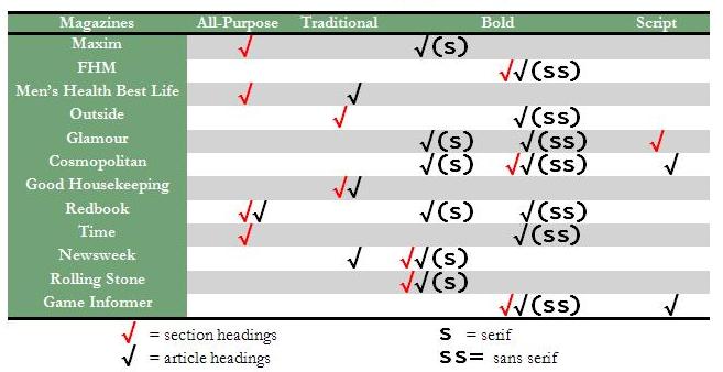
Table 14 illustrates the typographic trend of body text and miscellaneous blurbs in News Magazines. Black checkmarks signify body text and red checkmarks signify blurb text.
Table 14 : Comprehensive Body Text and Blurb Magazine Listing